How to Make App Store Screenshots That Actually Convert
Your screenshots are the most-viewed marketing asset your app will ever have — and most makers waste them. They upload three raw screen grabs, no captions, in whatever order the export dumped them, and then wonder why their install rate is flat.
Screenshots are not documentation. They are a silent sales pitch that plays out in about two seconds while someone decides whether to tap "Get." This guide is a practical walkthrough of how to make app store screenshots that move that decision in your favor — the caption formulas, the ordering, the design rules, and the exact workflow, whether you are on iOS, Android, or both.
Before you design a single frame, make sure you are building at the correct dimensions. If you have not locked those in yet, start with our guide to App Store screenshot sizes in 2026 so you are designing on the right canvas from the first pixel.
Why screenshots matter more than your description?
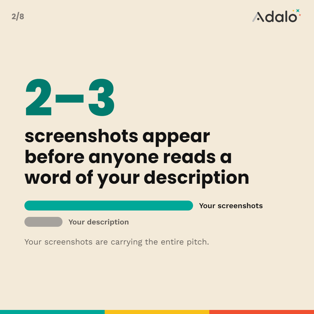
On the product page and in search results, the first two or three screenshots appear before a user reads a word of your description. Most people never expand the description at all. That means your screenshots are carrying the entire pitch: what the app does, who it is for, and why it is better than the alternative they were about to download instead.
Treat them accordingly. A great screenshot set can lift your conversion rate — the percentage of people who view your listing and then install — without spending a cent on ads. That is the highest-leverage design work in your entire launch. Screenshots also feed the broader discovery picture; see how they fit into the full strategy in our ASO playbook for indie and no-code developers.
What should the first App Store screenshot show?
Your single strongest benefit, stated as an outcome, paired with a clean real screen from your app.
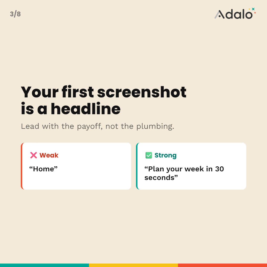
The first frame is a headline. It has one job: make the right person think "that's exactly what I need." So lead with the payoff, not the plumbing. Never open on a login screen, an empty state, a settings page, or a screen that only makes sense after onboarding.
Weak first frame: a home dashboard with a caption that says "Home." Strong first frame: the same app with a caption that says "Plan your week in 30 seconds."
Ask yourself: if a stranger saw only this one image, would they understand what the app gets them? If not, it is not your first frame.
The 5-frame story structure that converts
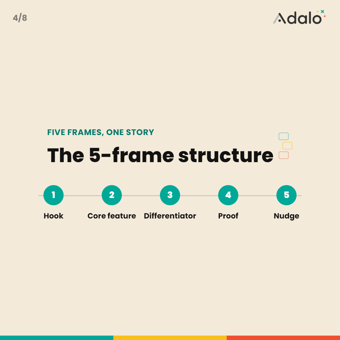
Think of your screenshots as a short narrative, not a gallery. This five-frame structure works for almost any app:
1) The hook — your #1 benefit and best screen. The reason to download.
2) The core feature — the main thing the app does, shown in action.
3) The differentiator — what makes you better than the obvious competitor.
4) Proof or breadth — a second key feature, social proof, or a "look how much it does" frame.
5) The nudge — an easy final beat: free to start, works offline, no account needed — whatever lowers the barrier to tapping Get.
Upload 5 to 8 frames total. Apple allows 10 and Google Play allows 8 per form factor, but quality beats quantity. Extra frames should extend the story, never repeat it.
How to write screenshot captions that sell
Captions are where most of the conversion lift lives, and they are the easiest thing to get wrong. Rules that work:
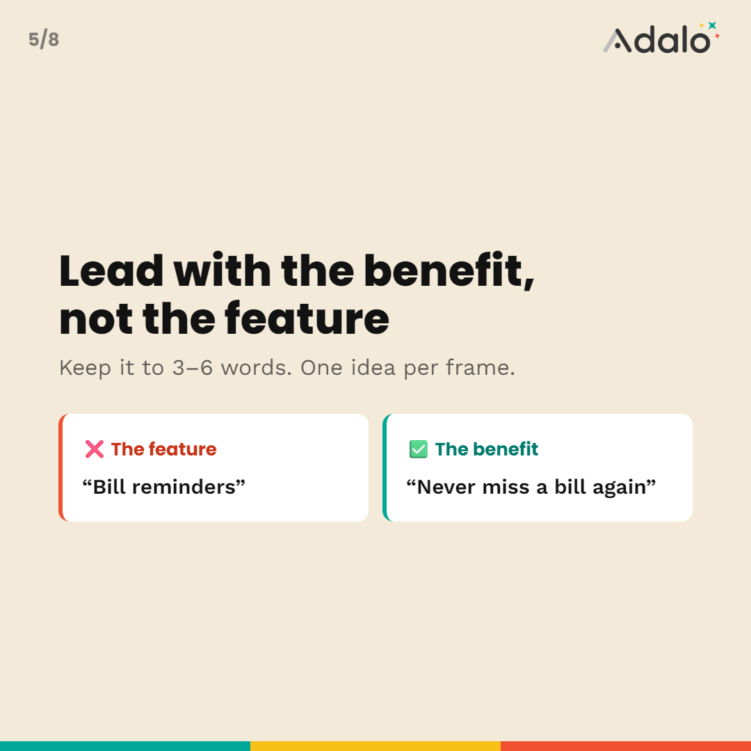
⚫Lead with the benefit, not the feature. "Never miss a bill again" beats "Bill reminders."
⚫Keep it to 3–6 words. These are read in a glance at thumbnail size. Long sentences die.
⚫One idea per frame. If a caption needs an "and," split it into two frames.
⚫Use active, plain language. "Track spending automatically" not "Automated expenditure tracking functionality."
⚫Match the caption to the screen behind it. The image should visibly prove the caption's claim.
Caption formulas you can steal
⚫Outcome: "Get organized in minutes"
⚫Speed/ease: "Set up in under a minute"
⚫Pain removed: "No more spreadsheets"
⚫Social proof: "Loved by 10,000 runners" (only if true)
⚫Objection-killer: "Works completely offline"
Write the captions before you design. If the words are strong, the layout has something worth framing.
App store screenshot design: the rules that matter
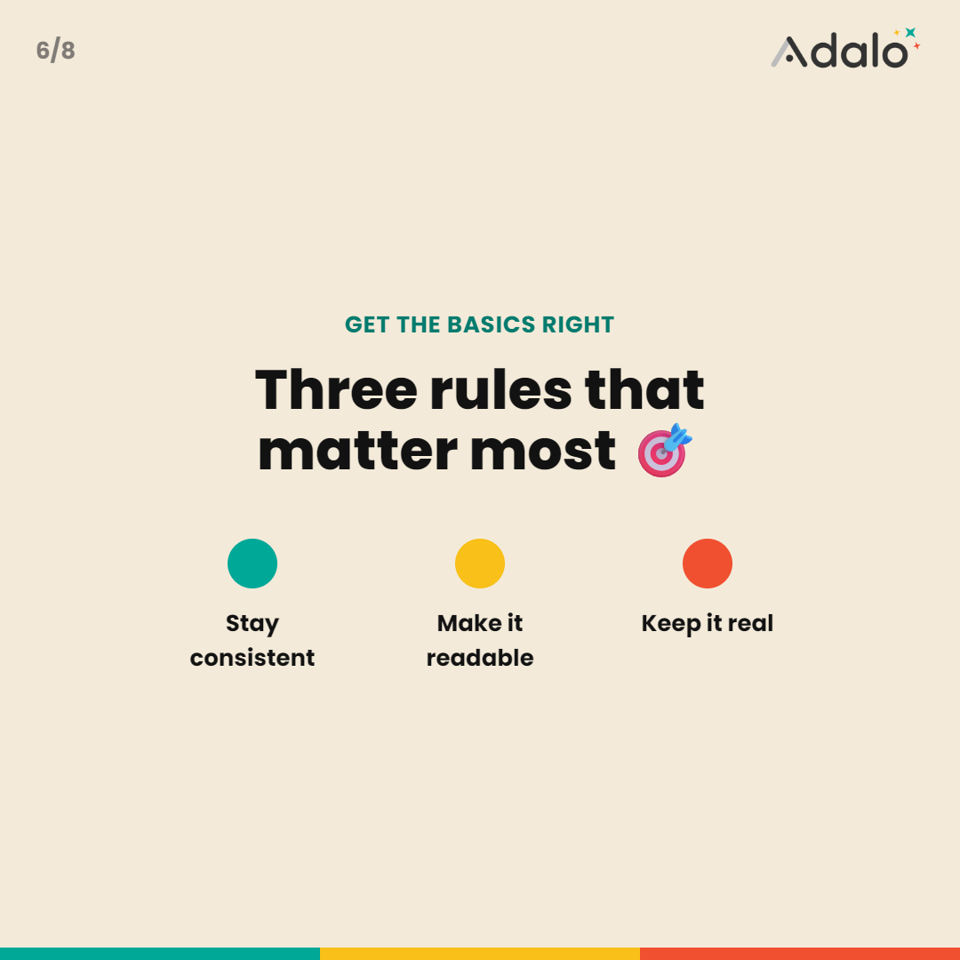
You do not need to be a designer, but you do need a few disciplines. These are the app screenshot best practices that separate professional listings from amateur ones:
1. Consistency across the whole set
Same background style, same caption font and position, same device frame treatment on every frame. A consistent set reads as a polished product; a mismatched set reads as thrown together. Pick a system and hold it across all 5–8 frames.
2. Readable at thumbnail size
Design at full resolution but constantly preview small. In search results your screenshot might be 120 pixels wide. If the caption is unreadable and the screen is a gray blur at that size, redesign it. Big text, high contrast, one focal point per frame.
3. Device frames — usually yes
Placing your screen inside a clean device frame makes it instantly read as a real app and gives the caption a natural place to live above or below. Just do not add a frame so large the actual UI becomes tiny. The screen is the star.
4. On-brand color, off the default
Use your brand colors for backgrounds and caption bars so the set feels like your product, not a stock template. A subtle gradient or solid brand color behind a framed device beats a flat white background almost every time — it stops the scroll.
5. Show real UI, not fantasy
Apple rejects screenshots that don't reflect the actual app. Beyond compliance, faked UI erodes trust and inflates uninstalls. Show the real product looking its best — populated with realistic (not empty, not absurdly perfect) data.
6. Consider a panoramic set
A popular pattern is a single background image or headline that spans across the first few frames, so as the user swipes it feels like one connected scene. Done well it looks premium; done sloppily it looks broken. Only attempt it if your captions still make sense frame by frame.
A step-by-step workflow
Here is the actual sequence to go from nothing to store-ready:
1) Write your 5 captions first using the story structure above.
2) Capture clean screens from your app that prove each caption. Use realistic data.
3) Pick a size and canvas — 1320 × 2868 for iPhone, 1080 × 1920 for Google Play. (See the screenshot sizes guide if unsure.)
4) Choose one design system — background, font, frame, caption placement — and apply it to frame 1.
5) Duplicate and swap for frames 2–5 so the set stays consistent.
6) Preview at thumbnail size and fix anything unreadable.
7) Export at exact store dimensions in the required format.
8) Order deliberately — hook first, nudge last — before you upload.
The tedious parts here — getting exact dimensions, keeping a consistent system across frames, and exporting clean files — are exactly what a purpose-built tool removes. The App Store screenshot generator gives you a free-form canvas with device frames, Google Fonts, backgrounds, shadows, and 3D tilt, and exports the exact iPhone and Google Play sizes so every frame is store-ready by definition. Design and preview for free; you only pay to export.
Common screenshot mistakes to avoid
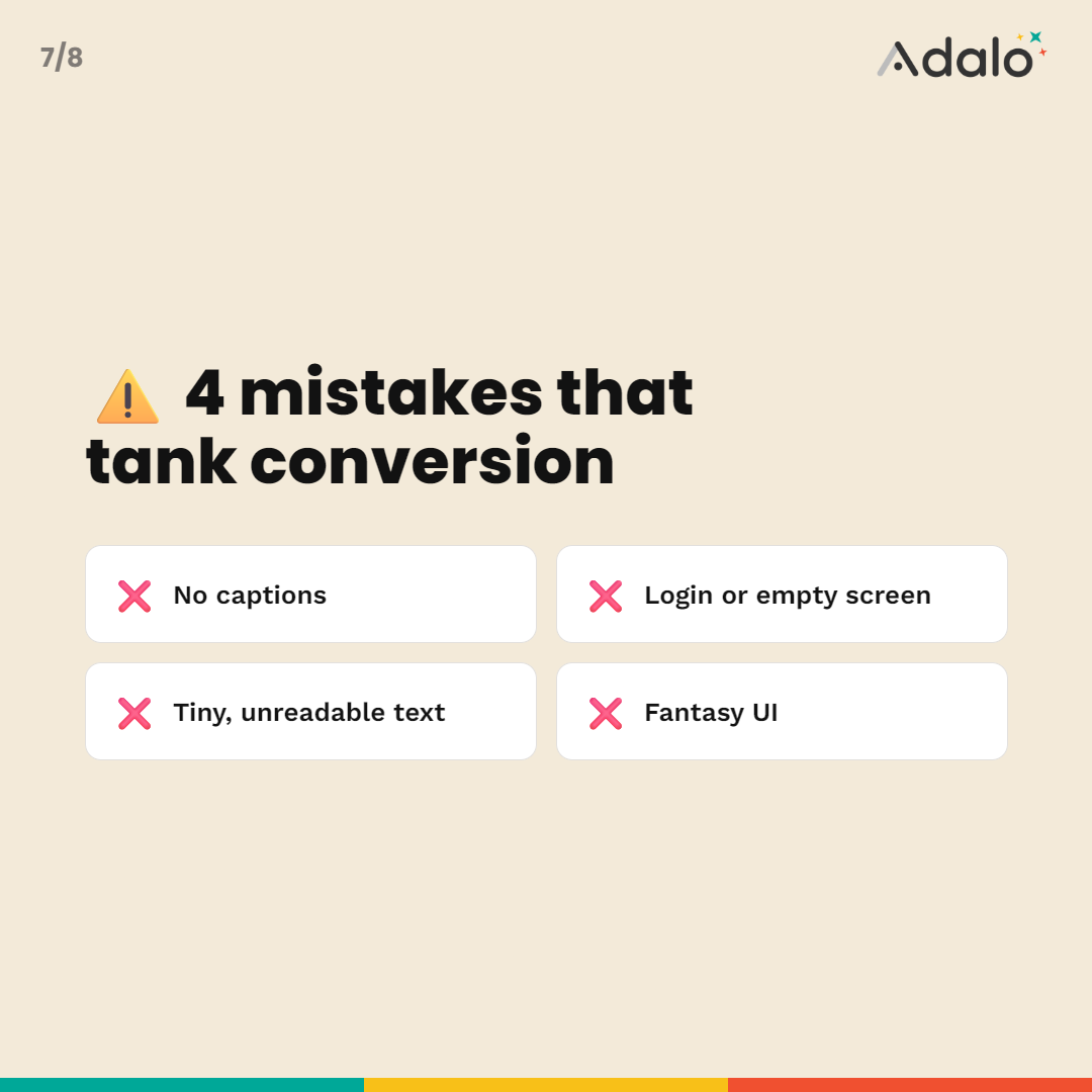
⚫No captions at all. The single most common mistake. Bare screen grabs make the browser do the interpretive work, and most won't.
⚫Opening on a login or empty screen. Wasting the most valuable frame on a barrier.
⚫Tiny, unreadable text. Designed for a 27-inch monitor, viewed on a 120-pixel thumbnail.
⚫Inconsistent styling. Five different fonts and backgrounds screaming "made in a rush."
⚫Repeating the same message. Five frames that all say roughly "it's great."
⚫Fantasy UI. Screens that don't match the real app — a rejection risk and a trust killer.
⚫Wrong dimensions. A perfect design at the wrong pixel size is a rejected design.
Want ready-made layouts to start from?
If you would rather not design a system from scratch, start from a proven layout and swap in your own screens and captions. Our collection of App Store screenshot templates gives you 12 copy-ready layouts — panoramic, single-device, feature-grid, and more — that already follow the rules above. Pick one, drop in your screens, ship.
Great screenshots are the cheapest conversion lever you have. Get the first frame right, write benefit-led captions, keep the set consistent, and export at the exact store sizes — and you will out-convert apps with bigger budgets and worse listings.
Frequently asked questions
How many App Store screenshots should I use?
Upload 5 to 8. Apple allows up to 10, but the real work happens in the first 2 to 3 frames — those are the only ones most people see before swiping. Use the extra slots to build on your story rather than repeat it.
Should App Store screenshots have text captions?
Yes. Captioned screenshots consistently outperform bare screen grabs because they tell the browser what each screen does and why it matters. Keep captions to 3 to 6 words, benefit-led, and readable at thumbnail size.
What should the first App Store screenshot show?
Your single strongest benefit — the reason someone would download the app — paired with a clean, real screen from your app. The first frame is doing the job of a headline, so lead with the outcome, not a settings page or a login screen.
Do I need a designer to make good App Store screenshots?
No. With a template-driven editor you can produce professional, on-brand screenshots at the exact store sizes yourself. The design principles matter more than software skill — clear captions, consistent style, and the right first frame do most of the work.

Tools mentioned in this guide:
App Store Screenshot Generator,
App Privacy Policy Generator.